Hewlett Packard Enterprise, Design System Team

OVERVIEW

HPE has recognized that inconsistent user experiences across its products made it difficult for users to work seamlessly between them. A major challenge was the lack of a unified notification system, with each product team implementing its own approach.

As a product designer on the Design System team, I led the effort to centralize and standardize notifications for adoption across nine different product teams; collaborating closely with other designers, developers, and user researchers along the way.

PROBLEM BREAKDOWN

So what problems did users face?
The lack of a singular notification system created several major issues:
  • Inconsistent designs and implementations, leading to fragmented experiences
    The same toast notification found in seven different live products.
    Seven different toast notification designs found in live products.
  • Oversight on accessibility, making notifications difficult to perceive and interact with
    This inline notification fails WCAG color contrast requirements.
    Inline notification failing WCAG color contrast requirements.
  • Notification misuse, where teams overused or improperly prioritized notifications
    An example of a screen that users reported having 'alert fatigue.'
    An example of three notifications displaying the same content and being used on the same screen.

DISCOVERY, RESEARCH, & INSIGHTS

Understanding the problem space
To better grasp the currently established notification systems, I collaborated with nine product teams to:
  • Define a notification taxonomy
    Alongside a user researcher, I conducted two dendrogram studies amongst the product teams to gain a better understanding of the different types of notifications and what they were being called.
    Dendrogram study to define taxonomy.
  • Understand the needs and requirements
    I reviewed documentation from each of the product teams to break down all of the elements that made up their notifications.
    Annotation of a notification component from a product team.
  • Evaluate use cases and notification flows
    I analyzed and grouped similar notifications across products, then dug into each flow to understand how, when, and why different notifications were triggered and used.
    Grouping notifications based on their functional purpose.
Reviewing industry standards
Aside from reading countless Medium and NNG articles, I analyzed notification patterns from many different design systems such as Carbon, Atlassian, and Spectrum.

I extracted insights around notification hierarchy, usage, interaction, styling, and development + accessibility constriants.
Staying accessible (WCAG compliant)
Ensuring notifications were accessible to all users was a key focus of this project, therefore, I researched many different accessibility considerations. Key considerations included:
  • Color contrast - Do text and background colors meet WCAG contrast ratios for readability?
  • Screen reader experience - How should notifications be announced with ARIA to ensure clarity and proper reading order?
  • Keyboard navigation - When a notification appears, where should focus go, and how would keyboard users interact with it?

Additionally, throughout the whole process, I was able to test the experience with a visually impaired product accessibility champion who relies soley on screen readers and keyboard navigation.

DESIGN ITERATIONS

Breaking down the deliverables
Based on our research, we were able to define a taxonomy of the most notable elements within a notification system. This provided us with the necessary guideline of what product teams required.
  • Taxonomy of HPE's Notification System.
Establishing the component anatomies
For the initial low fidelity drafts, I focused on outlining all the optional and required elements of each notification component.
  • Notification low fidelity anatomy designs
Exploring designs & receiving feedback
Gathering feedback was an essential step throughout the design process. During this project, I:
  • Lead review sessions with product teams – Connected with designers and developers to ensure the components fit their product needs.
  • Incorporated user feedback indirectly – Product designers gathered insights from their users and relayed them to me.
  • Validated accessibility compliance – Worked with a product accessibility champion to test screen reader and keyboard navigation flows.
  • Status indicators
    Status indicators are used to help convey the severity of a notification.
    Status indicator design explorations
  • Toast notifications
    Toast notification design explorations
  • Inline notifications
    Explorations for global, page level, and contextual inline notifications.
    Inline Notification design explorations.

SOLUTION & IMPACT

What was delivered?
After six months of research, design iterations, and way too many review sessions between nine different product teams, I lead the creation of:
  • An accessible and comprehensive notification system
    Final designs for the notification components.
    Final notification designs
  • Reusable Figma assets (over 25,000+ inserts so far in 2025)
    Component sets are being widely used across product teams for consistent adoption.
    Figma components were made for notification components.
  • Clear documentation and guidance - check it out!
    Includes live demos, usage examples, anatomy deep dives, do's and don'ts, a defined taxonomy, and general best practices.
    Screenshot of notification documentation.

REFLECTION

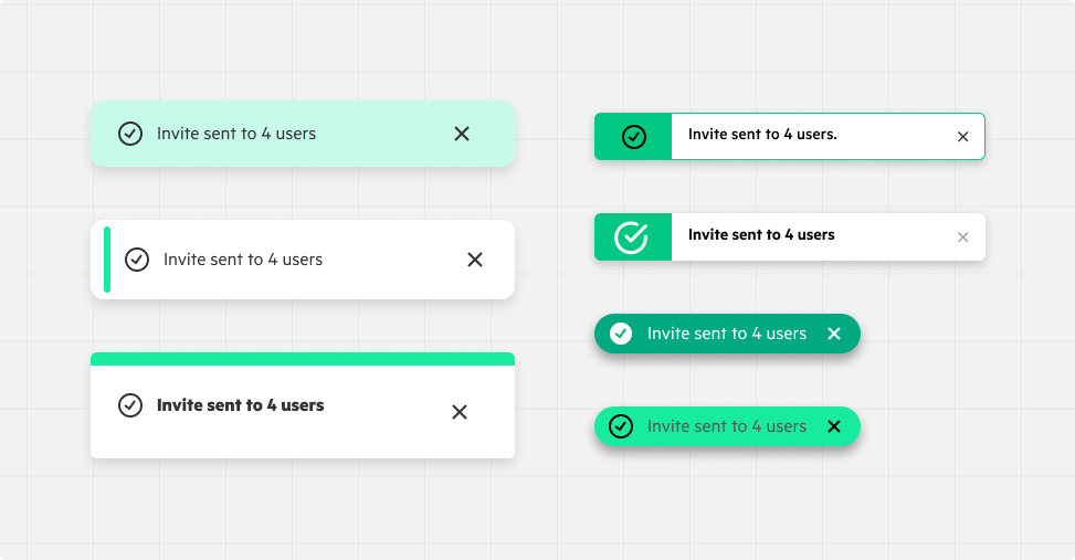
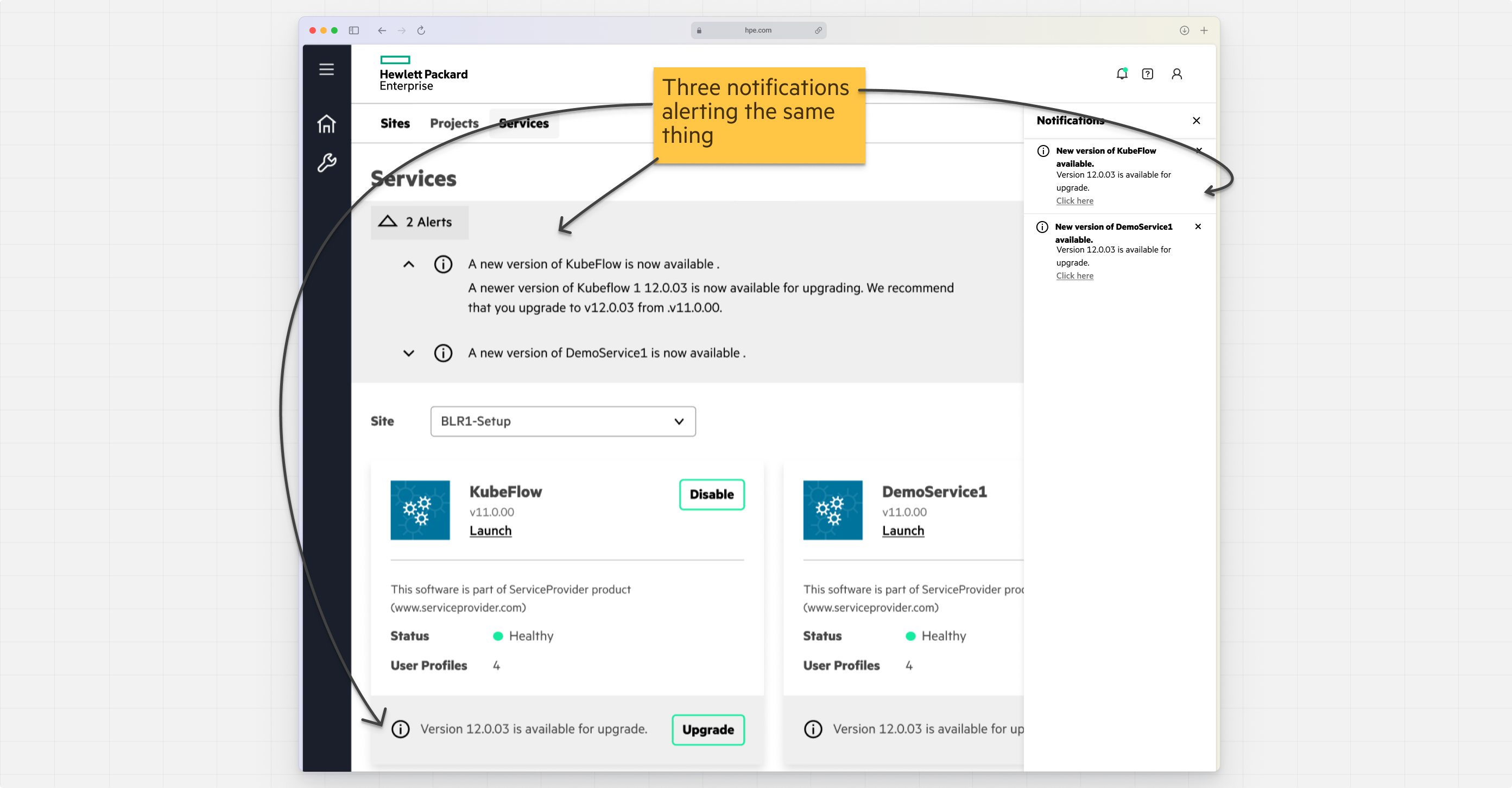
I learned that notifications are... tricky—there’s no one-size-fits-all solution (what design ever has one?).

One of the biggest challenges I faced was navigating differing opinions across teams, each with their own priorities and use cases. Most times, the best path forward wasn’t about finding a perfect solution but about aligning everyone around a single research-backed direction.

By fostering collaboration and creating clear guidance, we transformed fragmented decision making into a collective approach. While not every team got exactly what they envisioned, having a unified direction meant that notifications were more consistent, accessible, and effective across all products.

My biggest takeaway? A design system is great because it's never static—it evolves, adapts, and improves as teams learn and grow together.